The Grace Project
Our founder and CEO worked with Grace Development, Construction, and Procurement while she was still with the Chattanooga Times Free Press. Grace approached us looking for a logo, branding, and web design.
This is still one of Samantha’s favorite design projects she has ever worked on. She still enjoys seeing it in the wild out and about Chattanooga, TN.
Consultant
Logo
Branding Guidelines
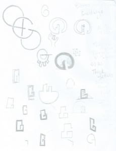
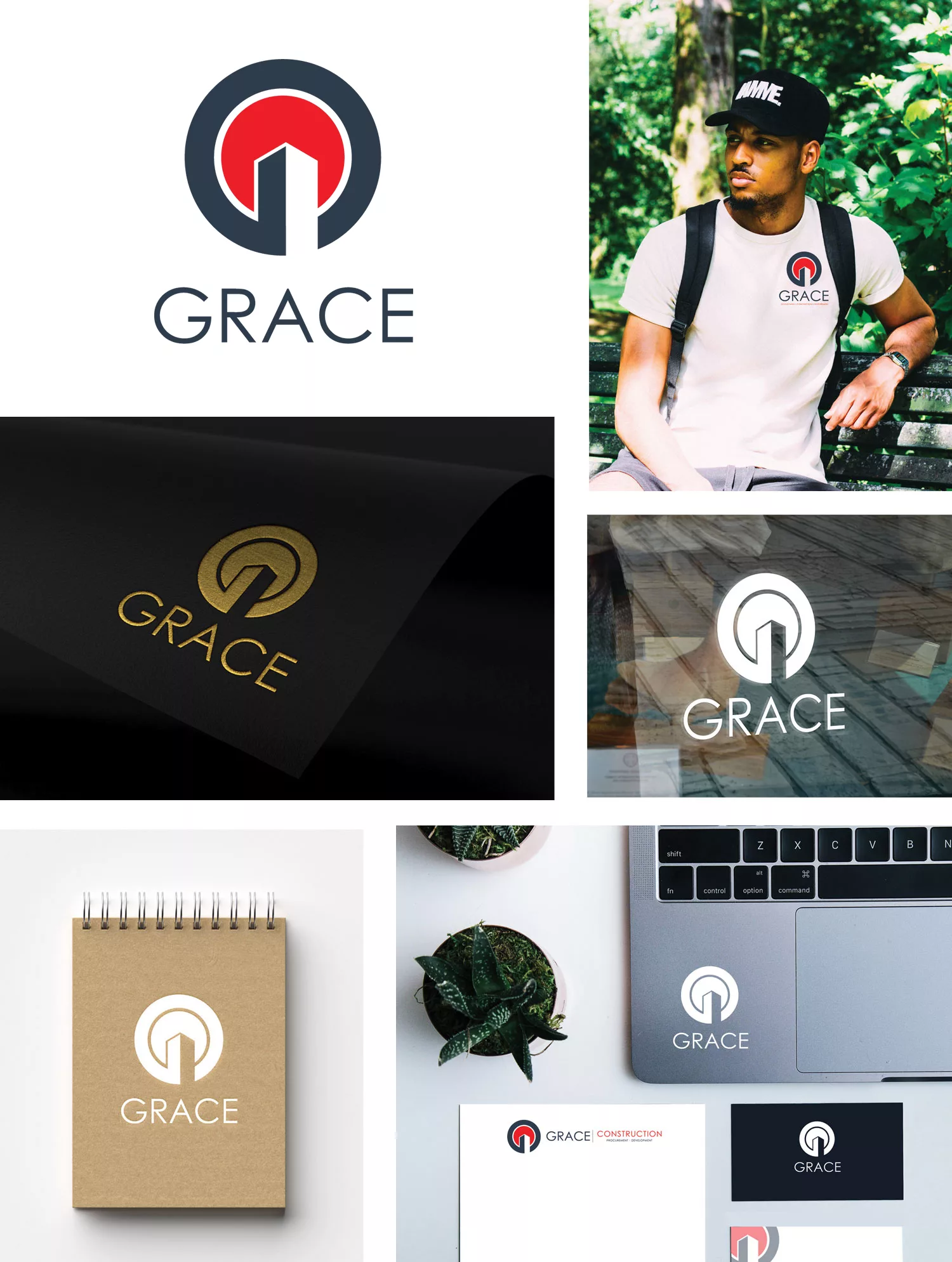
We used a “G” to create the abstract of a skyscraper with a sun in the background for a punch of color.
 Grace is a development, construction, and procurement company based in Chattanooga, TN.
Working with Grace to develop this logo design in Chattanooga, TN, was one of our proudest branding projects. One of the challenges of this project was creating a mark that so fully represented them. Countless hours were spent perfecting this, and the mark had to be completely symmetrical. This design was to represent that everything they do revolves around buildings. We used a “G” to create the abstract of a skyscraper with a sun in the background for a punch of color. The abstract of the skyscraper also creates this feeling of upward movement to represent that Grace raises buildings and people to takes ownership on every single project. The sky is the limit.

Ready to not only have a service provider but a partner in making your business a success?
